GO TRANSIT
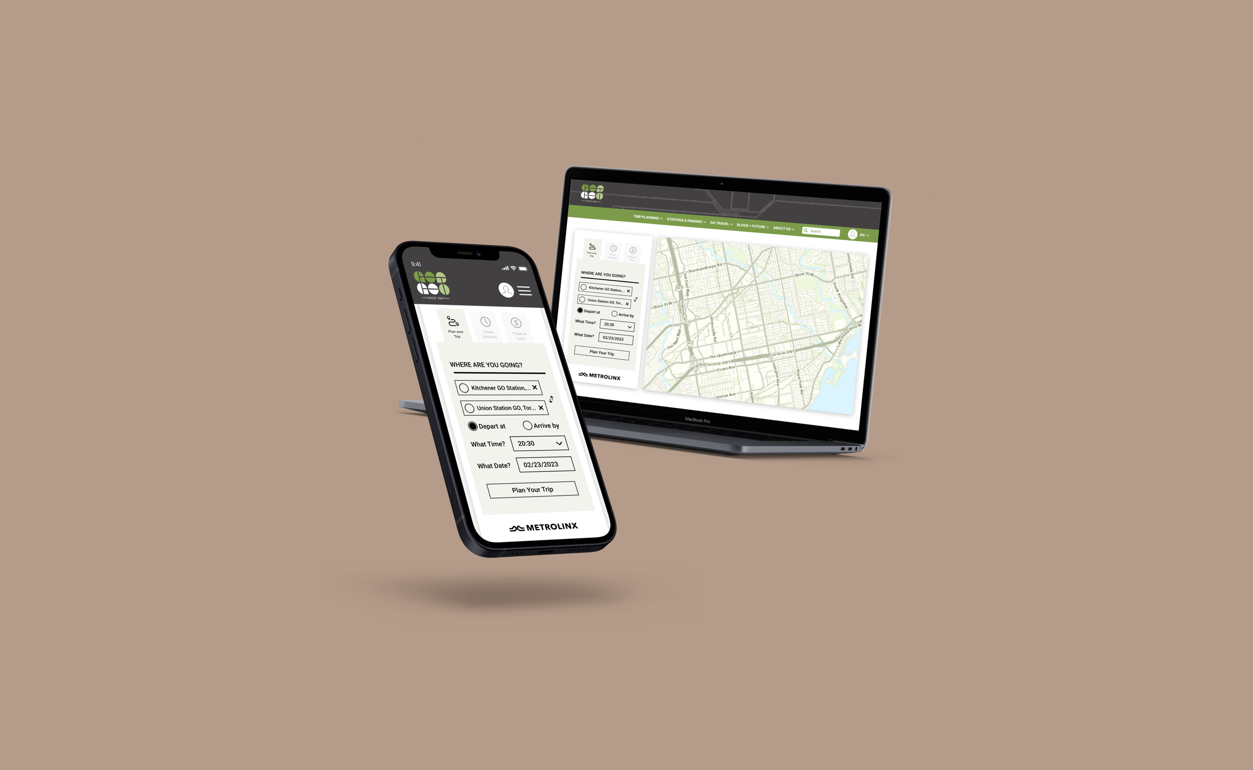
I led a team of five to re-design a provincial transit system’s website. We incorporated a small scale brand re-design, with an updated colour palette, enhanced logo, and uniform design language. With a data driven approach, we aimed to improve the experiences of desktop users, giving them the same respect as mobile users.
THE PROBLEM
GO Transit users are having a sub - optimal experience navigating and using the GO Transit website. If users are unable to efficiently plan their GO trips, they may be dissuaded from using GO Transit. Currently, the website prioritizes mobile users and disregards the needs of web users.
THE SOLUTION
An upgrade of the GO Transit design architecture while simplifying website navigation, and as a result catering to the user with a more user friendly and interactive experience.
VALUE PROPOSITION
GO Transit is the go-to-option for regional public transit service for the Greater Toronto and Hamilton Area. By redesigning the current navigation system, we will cater to the frequent GO Transit traveller by simplifying trip planning and incorporating their trip experience.
We are dedicated to providing an all-inclusive platform with live up-to-date information and essential notification system as we strive to make your trip as hassle free as possible.
Transforming for today, tomorrow and beyond, but better.
RESEARCH METHODOLOGIES
Preliminary exploratory survey conducted of GO Transit users. This highlighted key concerns, and gave us an understanding of what was working.
This was followed by an analysis of direct and indirect competitors.
User testing gave us data to create affinity diagrams and a feature prioritization matrix.
All of this data was used to inform the redesign.
KEY CHANGES
It was important for users to be able to plan their trip from the home page, so we maintained that functionality while giving it an aesthetic upgrade in line with our brand update.
Our brand update included a new logo and colour palette inspired by the heritage of Metrolinx and GO Transit. We softened the colours in order to make the website easier on users’ eyes.
The addition of a service map allows users to more easily visualize the scope of their journey. This was added to the hero section of the website.
.
We added a feature that allowed users to see their 3 most recent trips and their favourited trips upon sign in.
The website originally had a hamburger menu on the desktop view, so we redesigned the navigation bar and added it to the header.
We scaled down the footer and aligned it with the size of the web page.


